Bonus Round is not your average bar, its the perfect hangout spot filled with classic arcade games and good times. This space is created for those who miss the feeling of good old fashioned couch co-op. There's no better feeling than your friends cheering you on when you beat that high score. So come in, grab a drink, and get your game on!
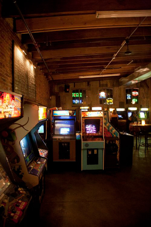
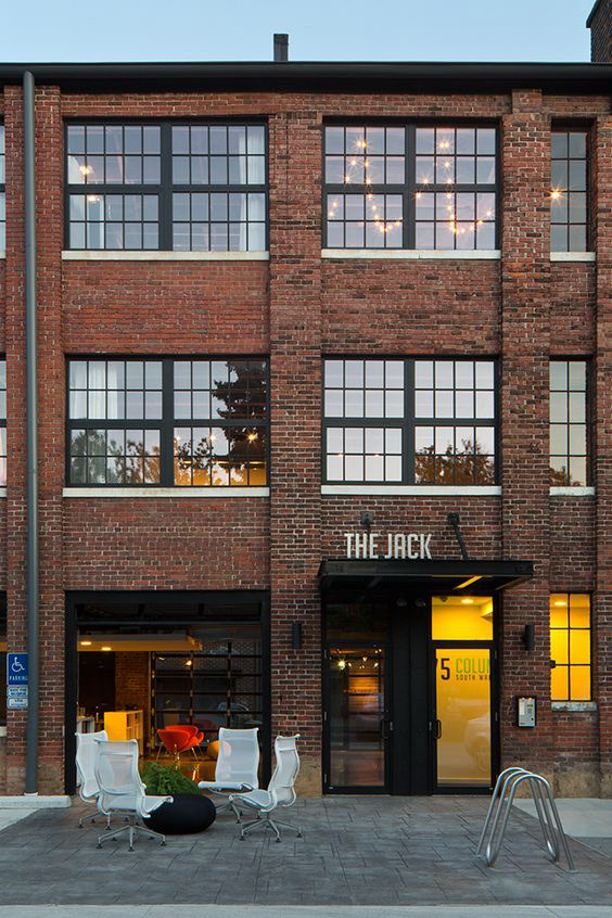
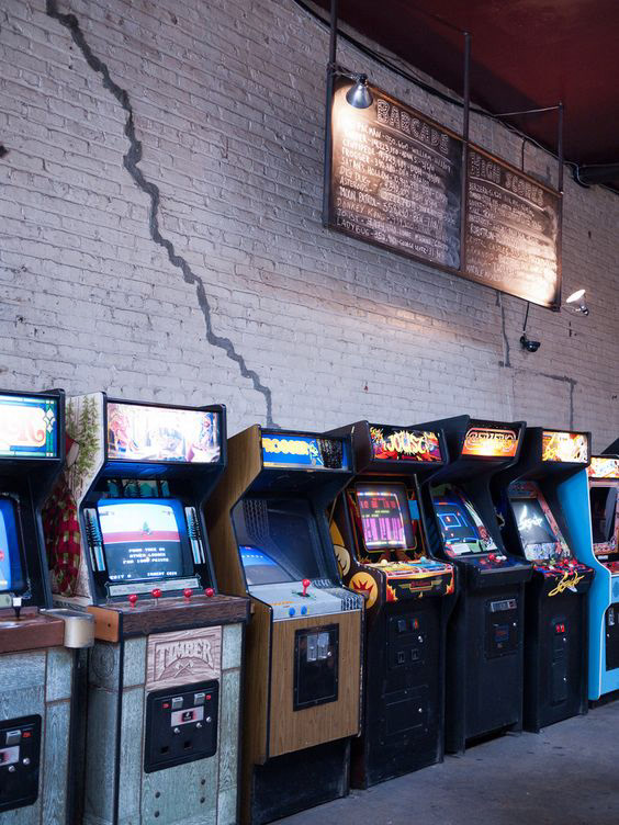
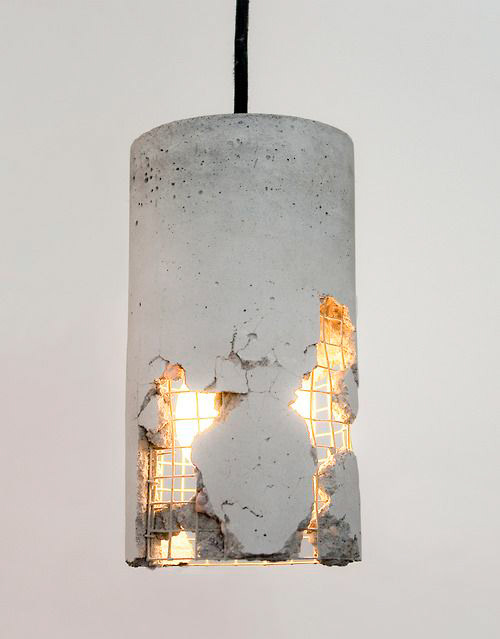
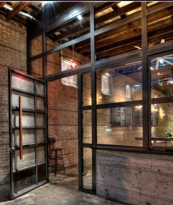
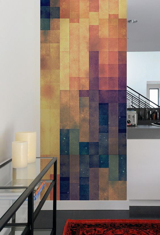
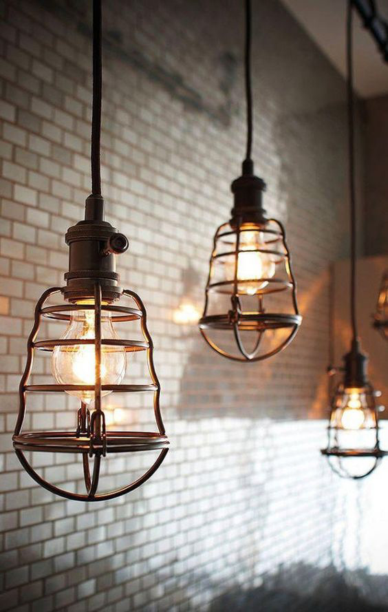
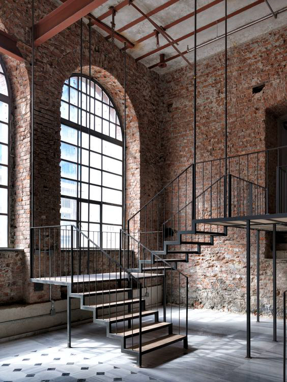
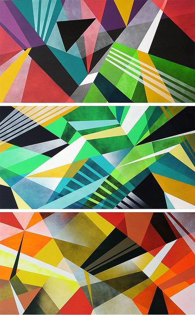
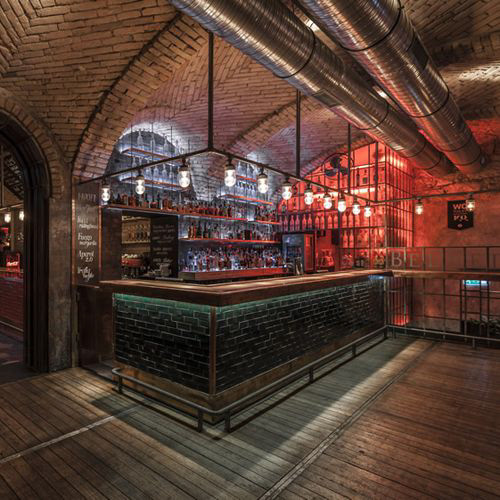
The interior space was inspired by a combination of industrial aesthetics and bold, colorful wall graphics. My goal was to create a contrast between the bright colors of the logo and the moody interior environment.
The logo design for Bonus Round was heavily inspired by mid-century signage. Being an arcade I wanted the logo to stand out and demand attention, similar to the way mid-century signage does.
Early in the design process, my goal was to mimic the graphics of old arcade machines. I did this by limiting myself to simple shapes and colors, However, I felt that the design was still missing something.
After looking deeper into mid-century signage and experimenting with some more complex colors I decided to make some much-needed changes to the logo. Tweaking the background columns to a ribbon shape better fits the theme of an arcade all while making the logo itself more interesting to look at.
The final logo features the removal of the flourishes and horizontal lines that separated the text as well as a new typeface, customized to fit the look and feel of the arcade. I feel these changes create a logo that is eye-catching but not distracting.