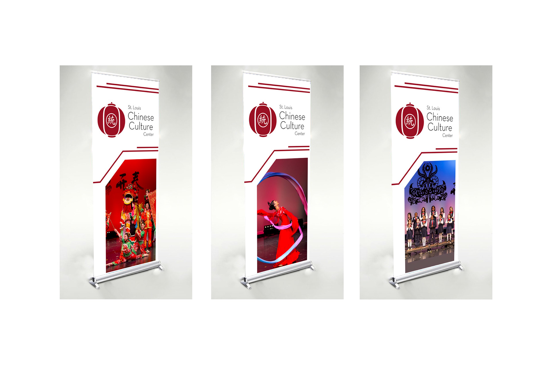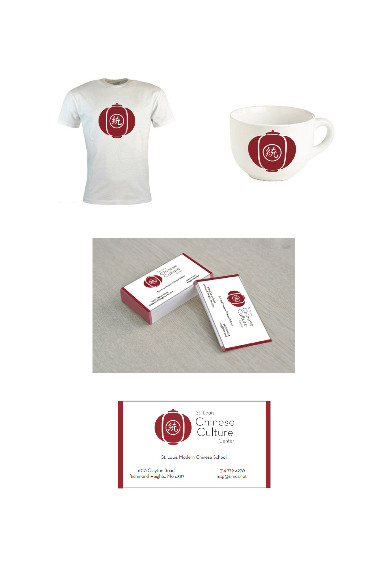
The St. Louis Chinese Culture Center is a non-profit organization working to enrich the lives of Chinese immigrants and to foster stronger multiculturalism in our community.
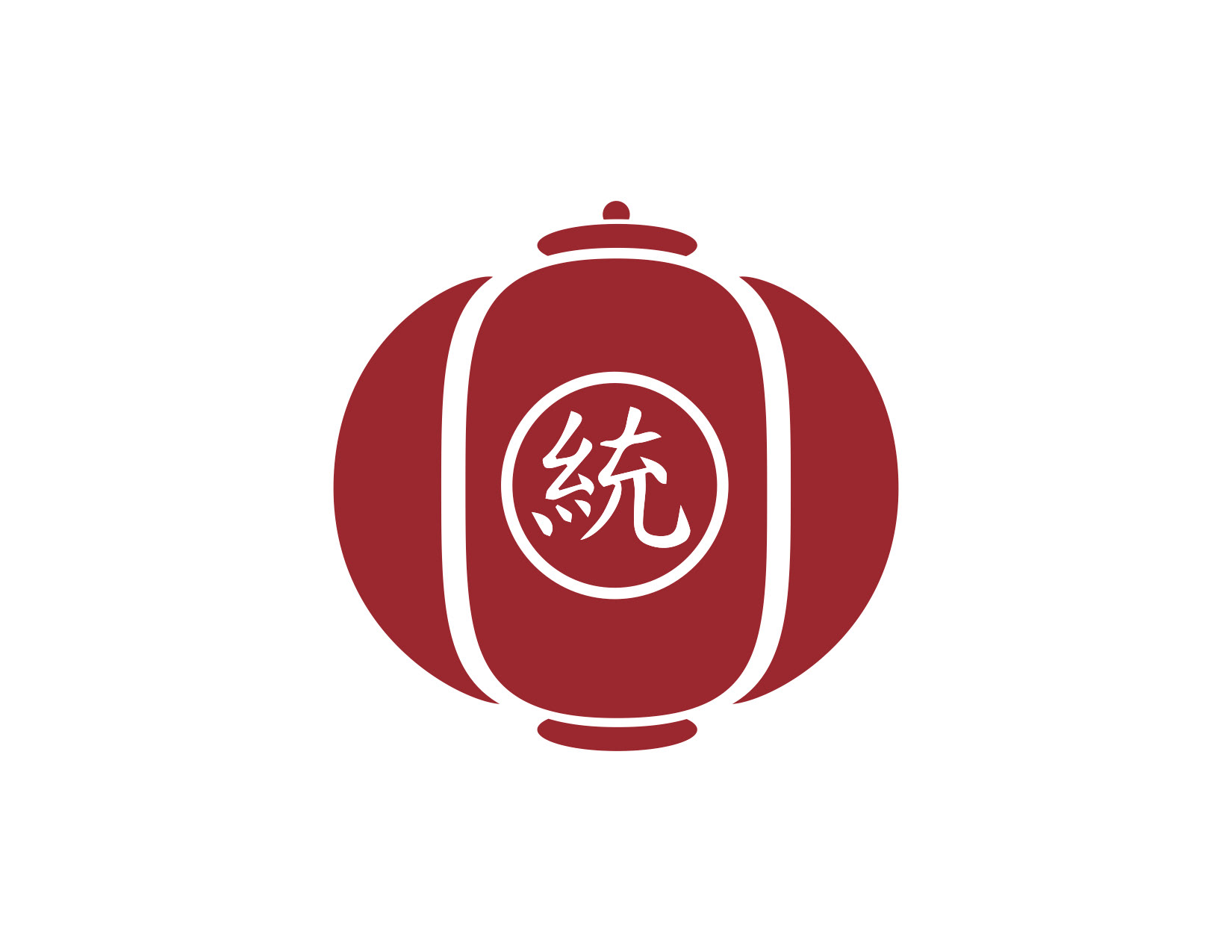
I took a lot of inspiration from traditional Chinese lanterns and stone shrines during the creation of this logo. The Chinese lantern represents flourishing life and prosperous business while stone shrines often represent respect and admiration of your ancestors. the prominence of the color red also holds some deep meaning, putting forth feelings of happiness and joy.

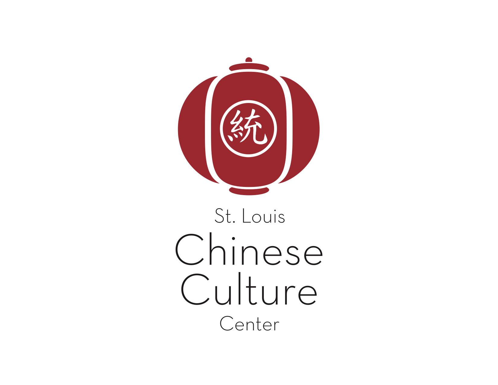
The center character was chosen for its meaning of unity, togetherness, and the interactivity of personal relationships. The welcoming message this logo puts forth perfectly aligns with the values of the St. Louis Chinese Culture Center.
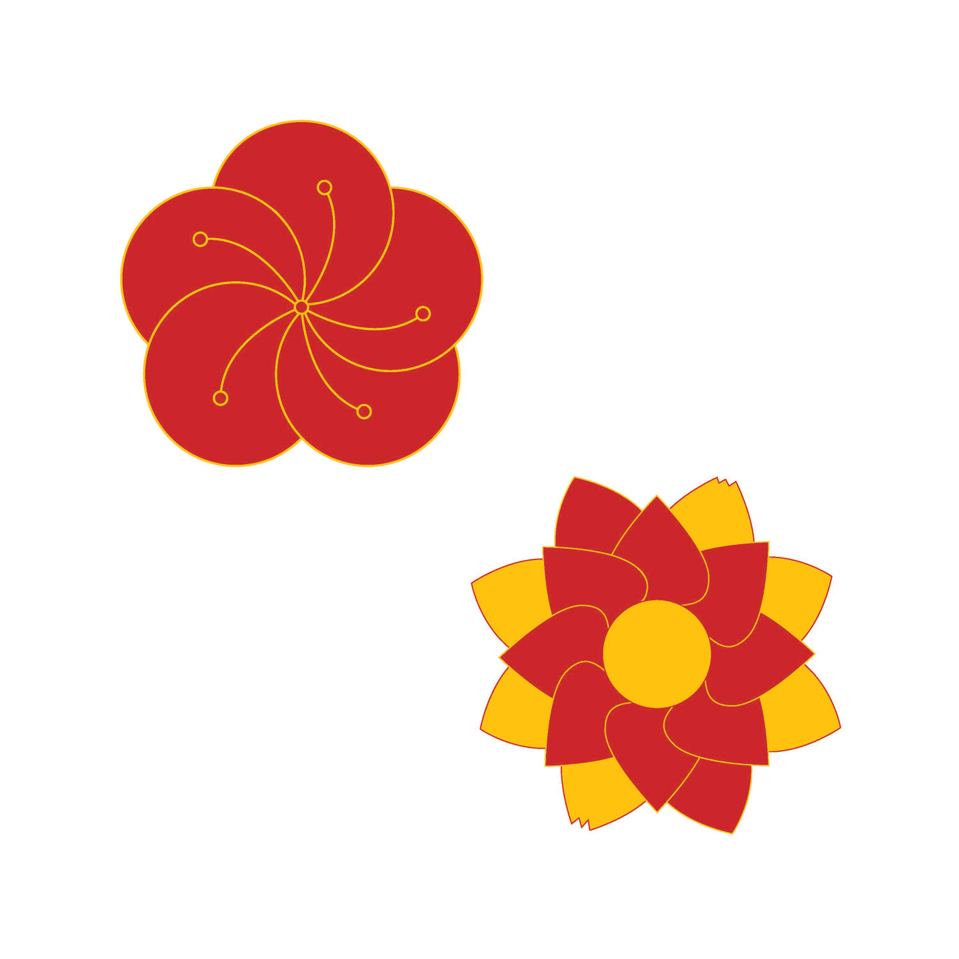
Before settling on Chinese lanterns as a source of inspiration, I was looking into both plum blossoms and lotus flowers. The plum blossom is the national flower of China and can be found throughout the country. Lotus flowers hold a spiritual meaning in China, being closely associated with Buddha, long life, and honor.
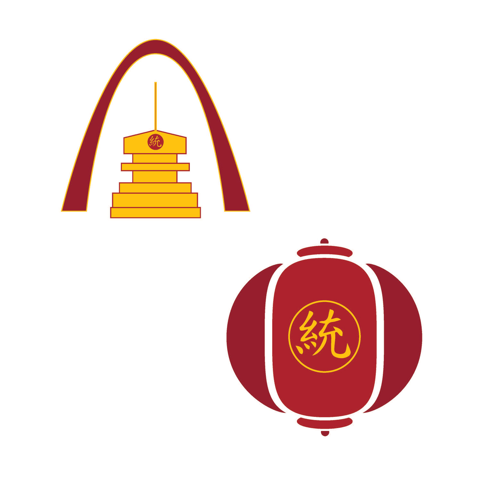
The St. Louis Chinese Culture Center requested a logo that put forth a feeling of traditional Chinese culture while also relating back to the city of St. Louis. Keeping this in mind i chose to use red and gold colors to represent China, I also attempted to incorporate symbols of St. Louis. After working with the designs I felt that keeping with these prerequisite were holding back the overall design. I began researching images of Chinese lantern festivals and came up with the design that I felt better represented the client.
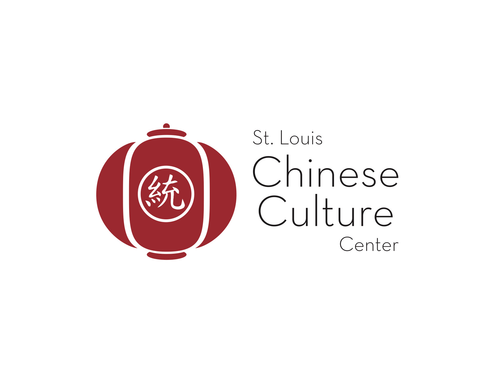
For the final design I chose to include a delicate typeface that would complement the logo. I also chose to simplify my color palette down to red and white. I felt that while the previous iteration included colors that were instantly recognizable as China, the logo itself was too busy and distracting. I feel the clean, flat colors create a more modern looking logo that will stand the test of time.