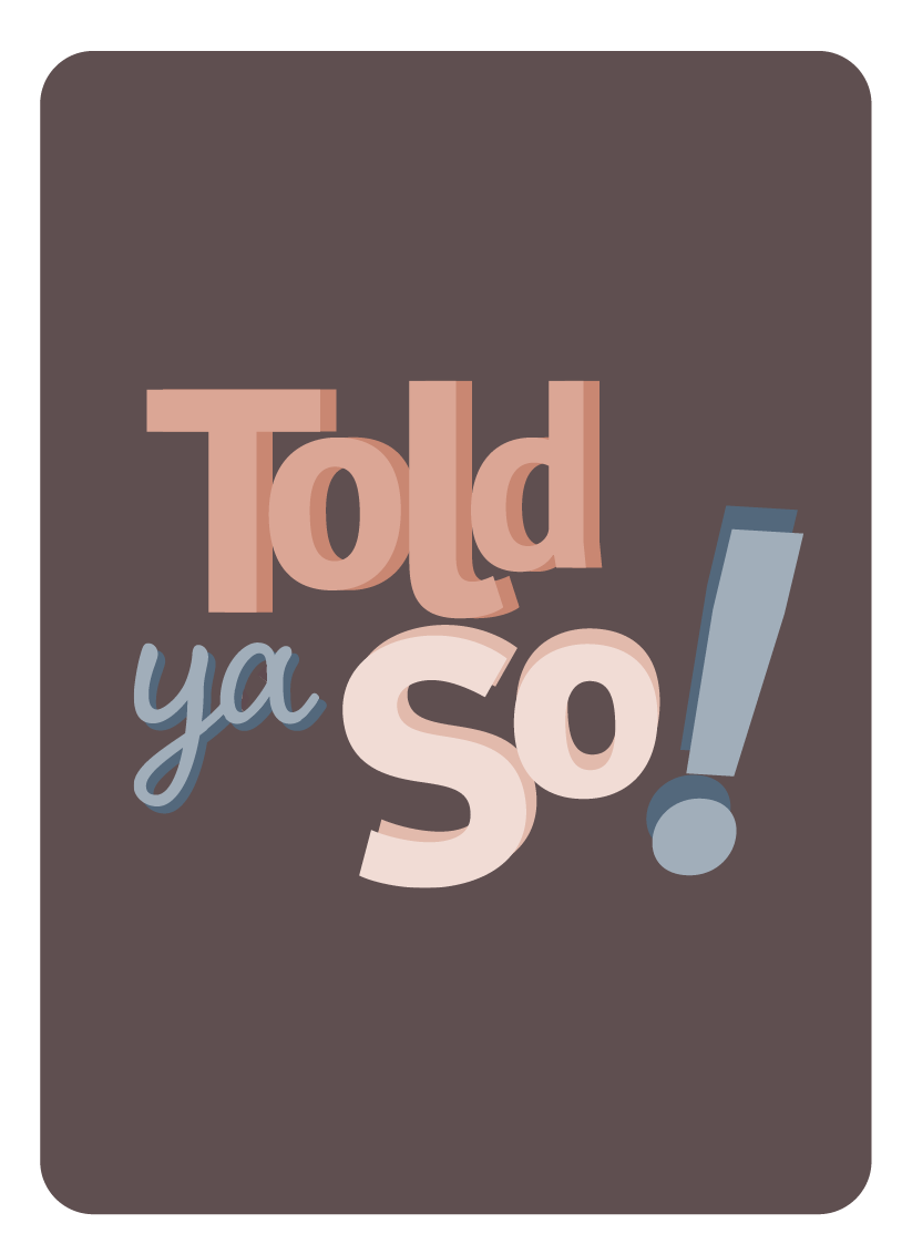
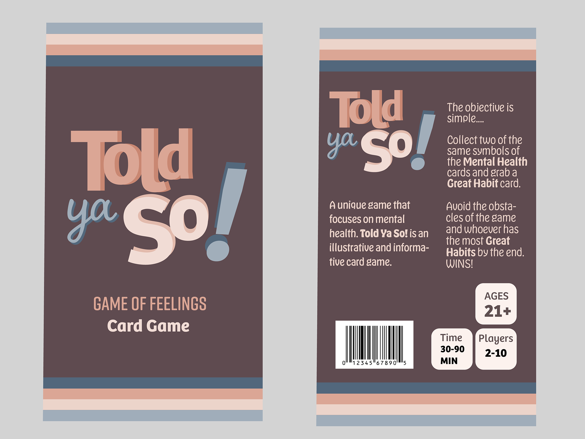
Identity
These are the specifics of the identity of Told Ya So! I made sure to include the most important aspects of what came into the recognizable features of creating this project. The icons, the color palette, font choice, and packaging.
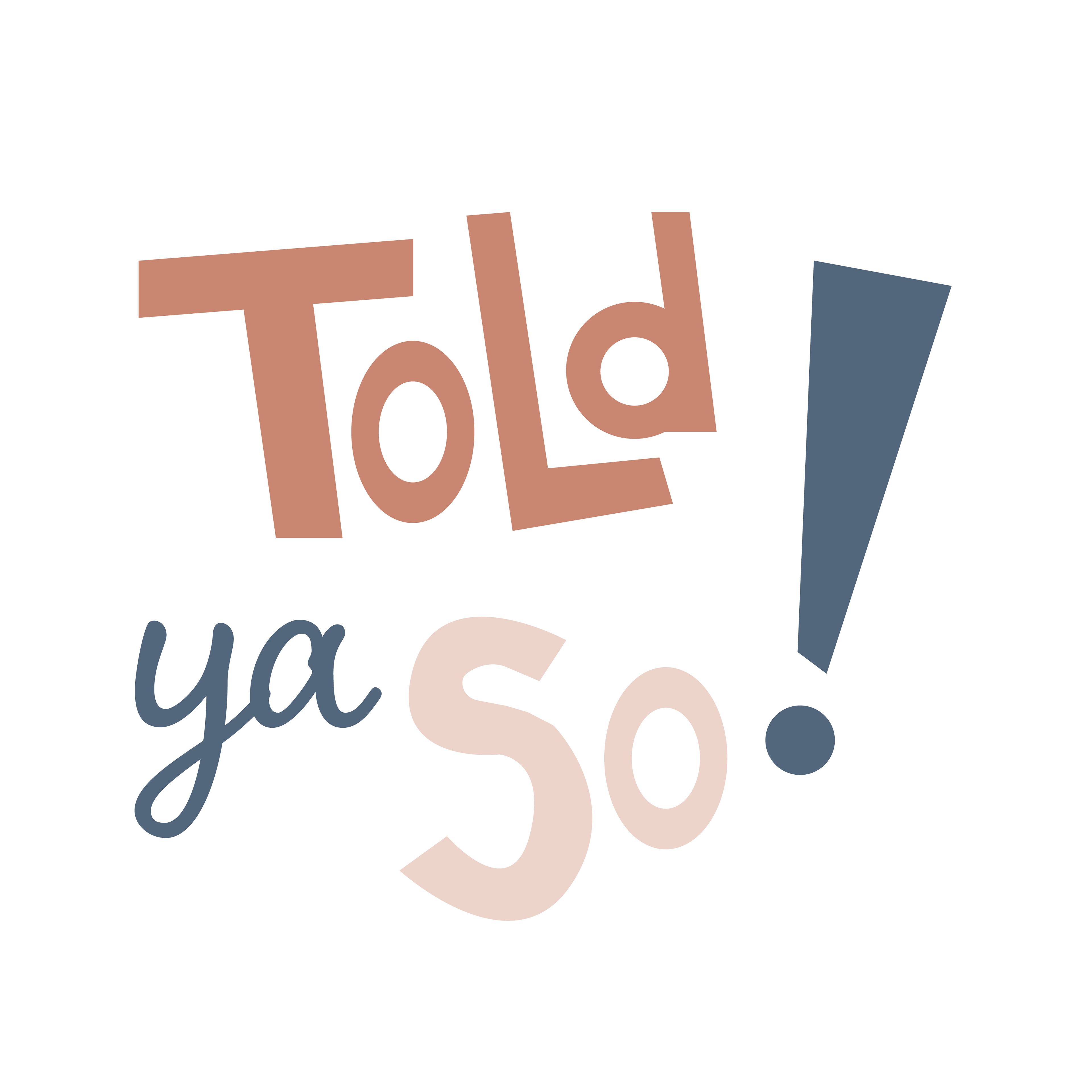
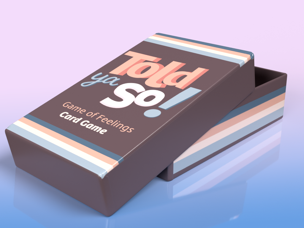
I was often contemplating if I should do a basic 2D icon for the title but it didn't stand out to me. Once I layered the colors the 3D look popped and that's when I knew it was the right choice for this project.
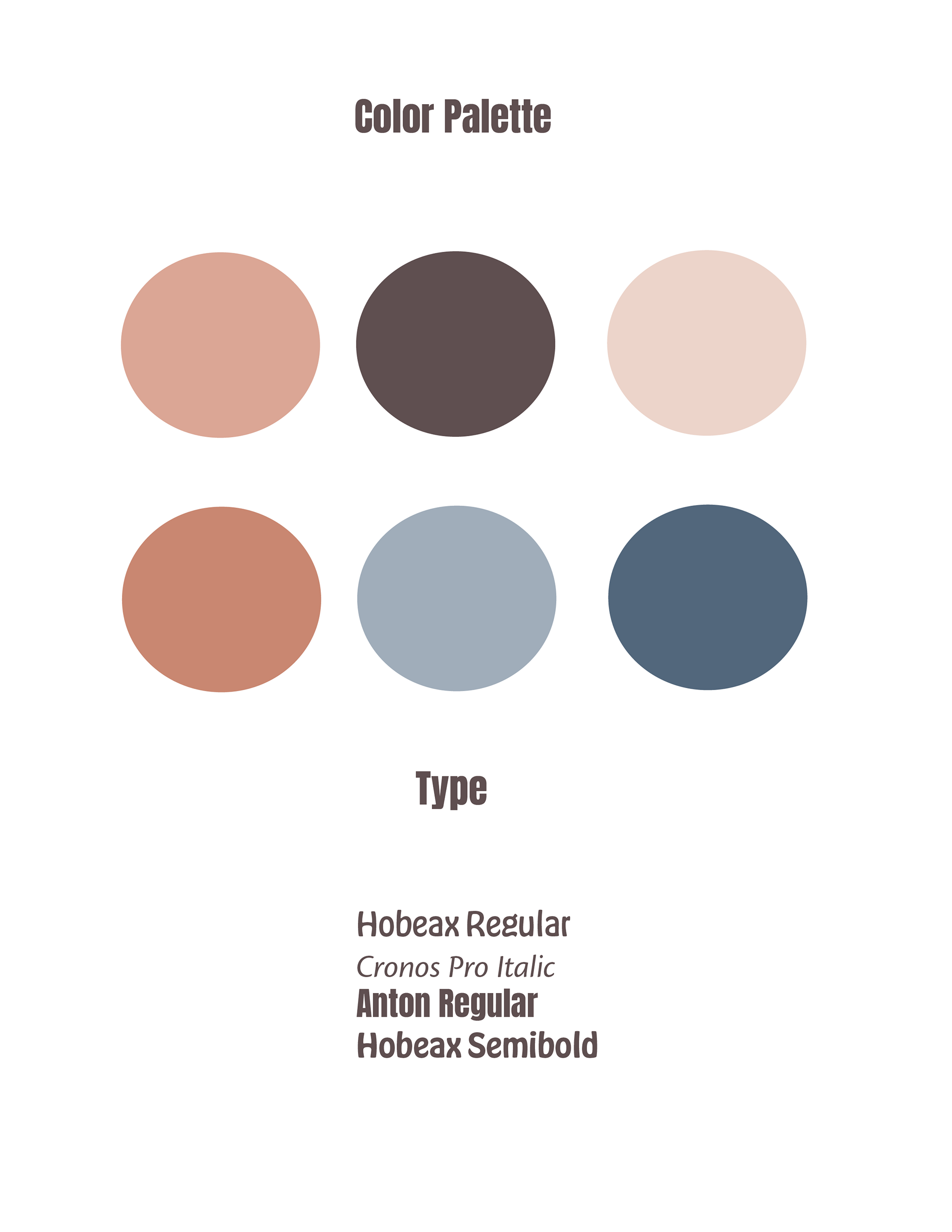
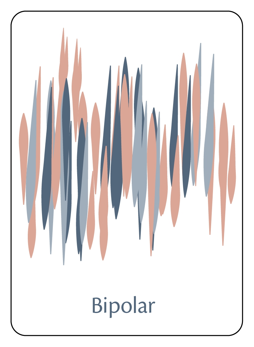
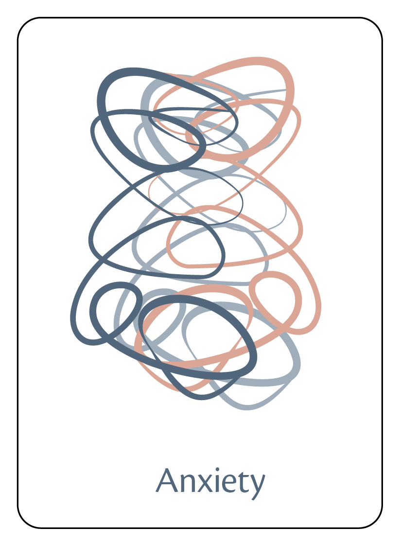
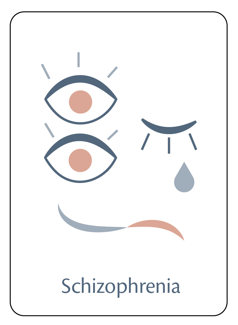
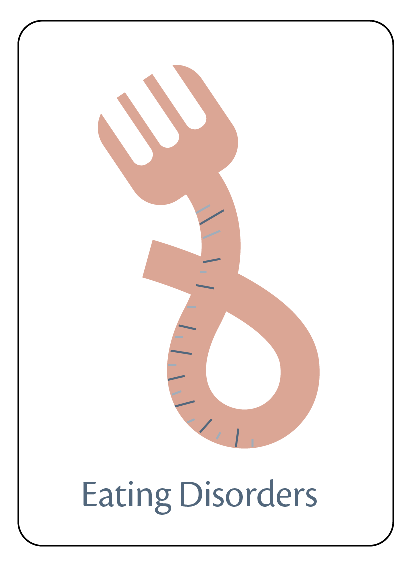
Colors had to be soft to offset the heavy mood of the topic. That's why I choose the muted pastel colors with warm undertones. For fonts, I wanted a mixture of thick and thin weights but with lots of movement to make it young and fresh.
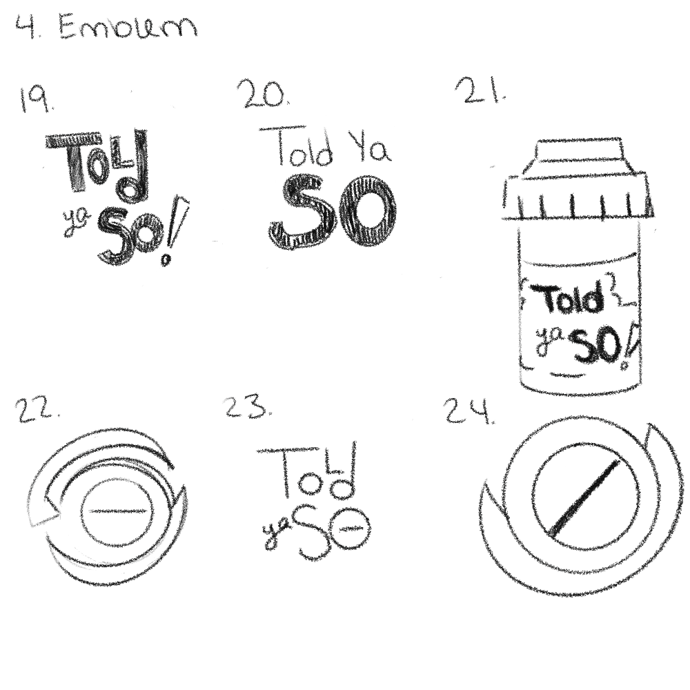
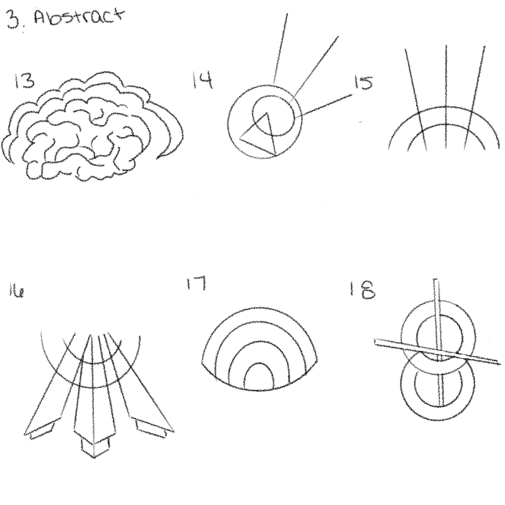
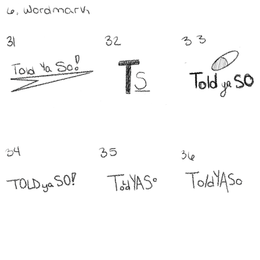
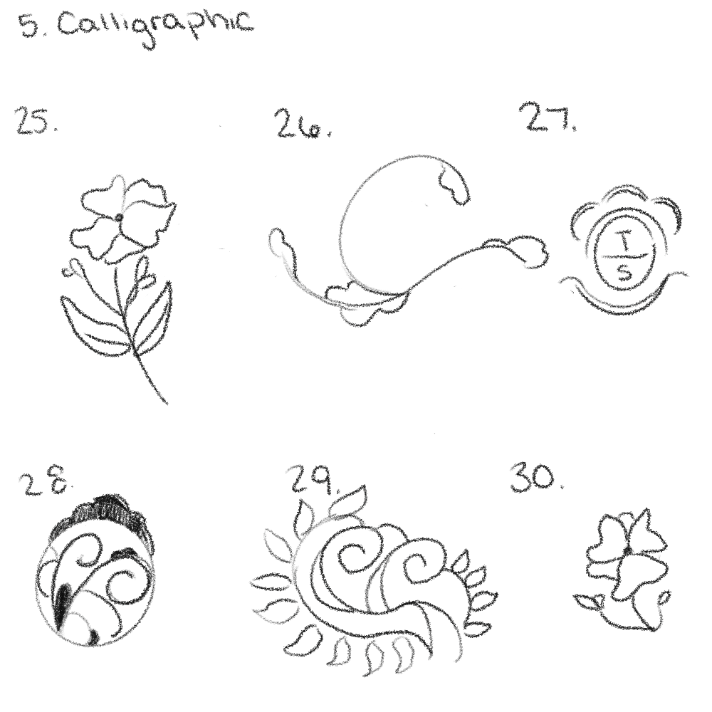
Sketches
As a designer, it's important to add the source of where it all started. I had lots of ideas before deciding on a type and even then I wasn't sure if I had made the right choice. That's why experimentation and playing with colors is the best thing. It makes your project come alive and THEN you can tell if you made the right decision.
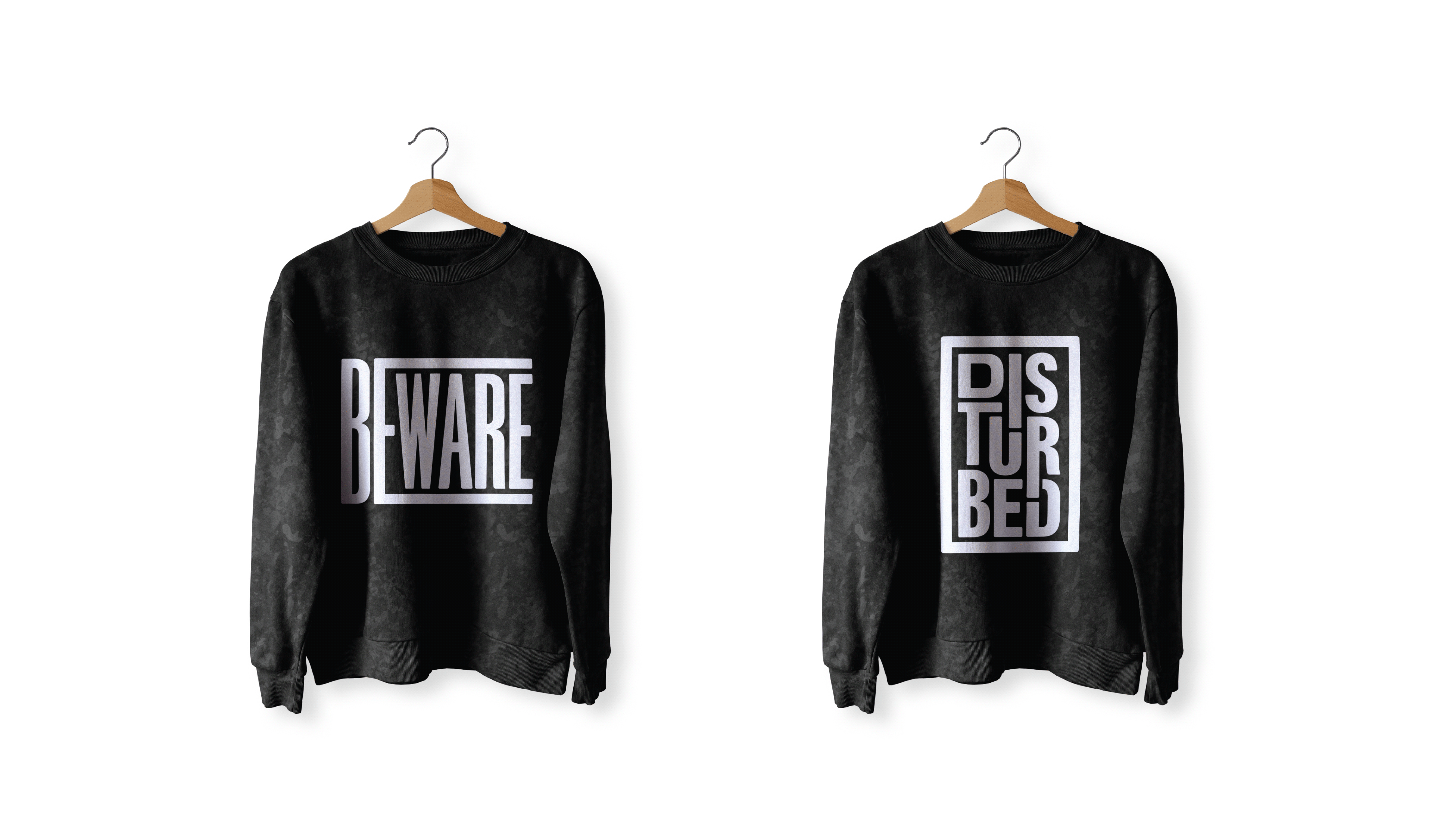
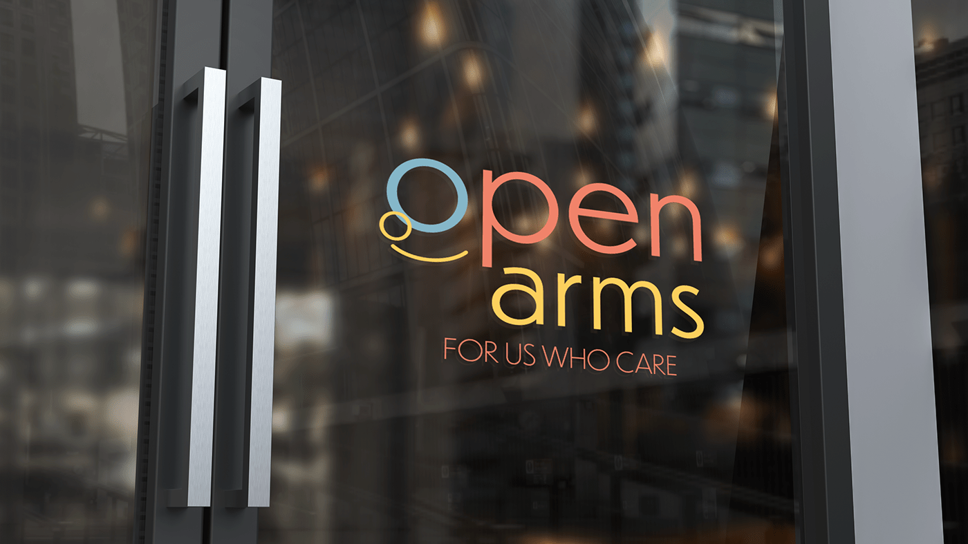
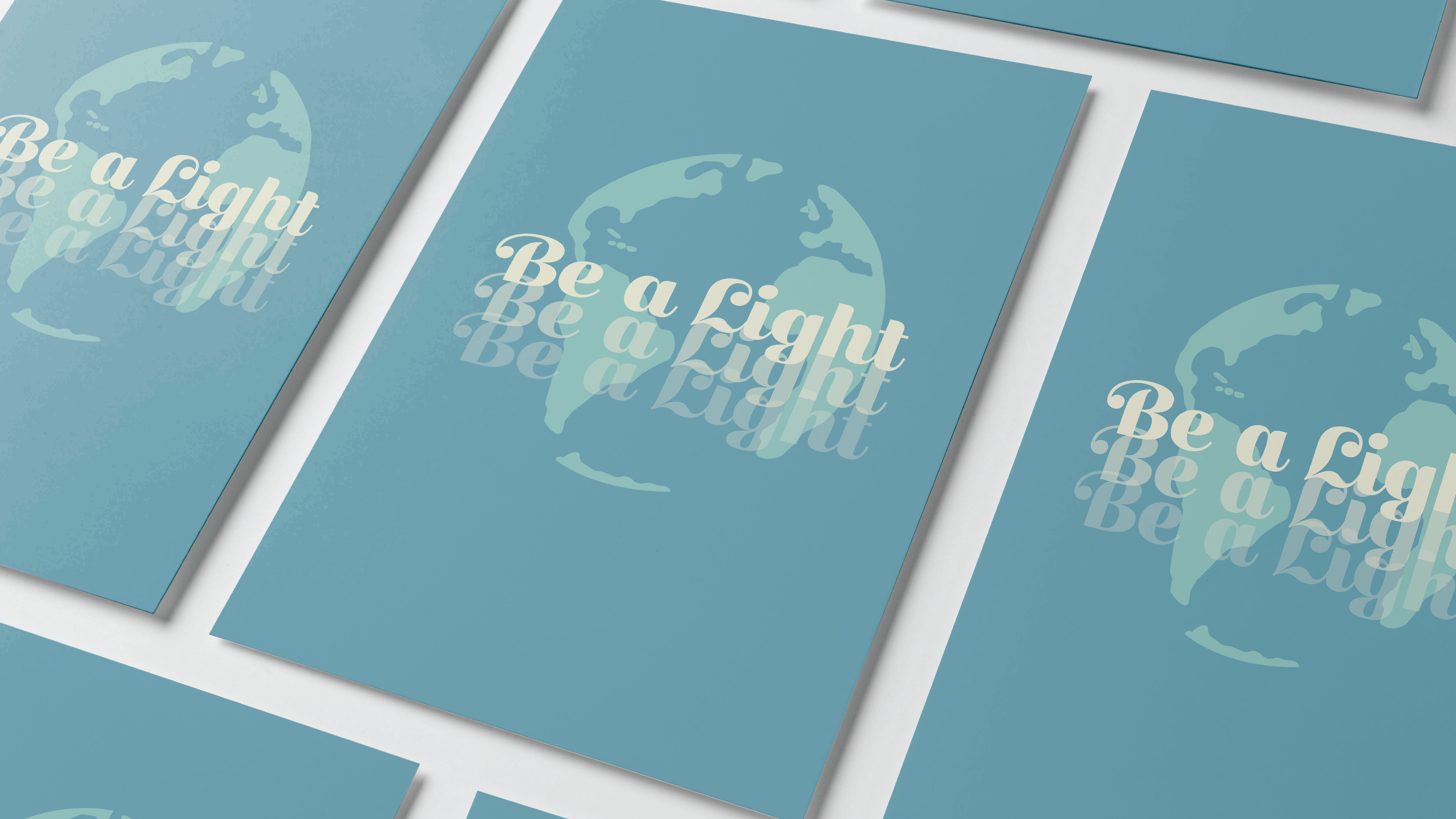
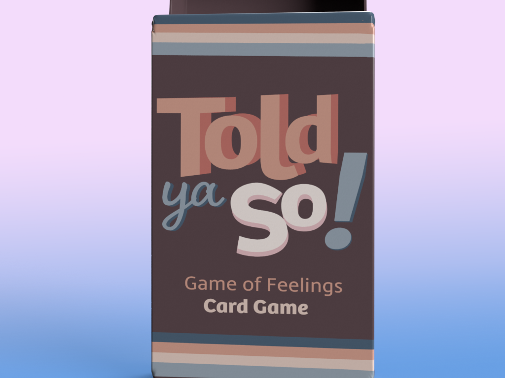
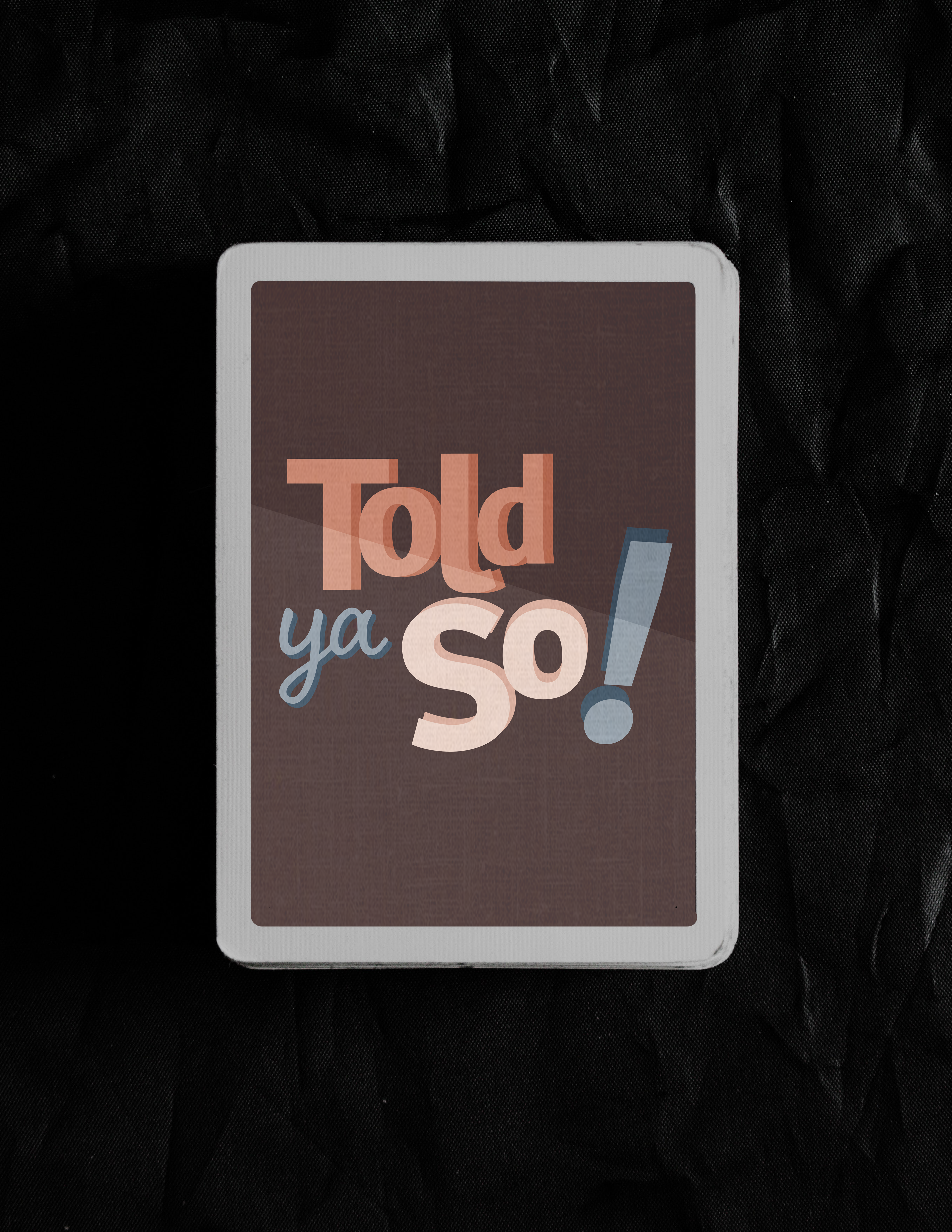
Mockups
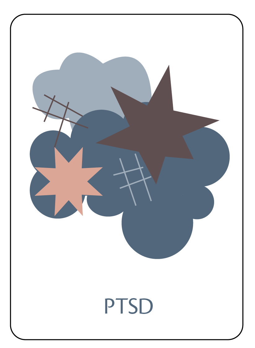
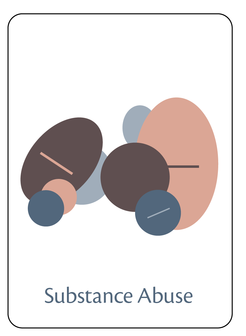
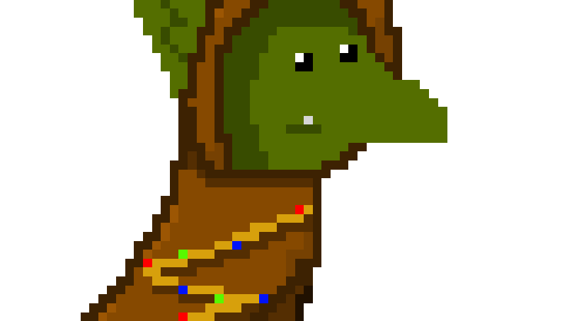
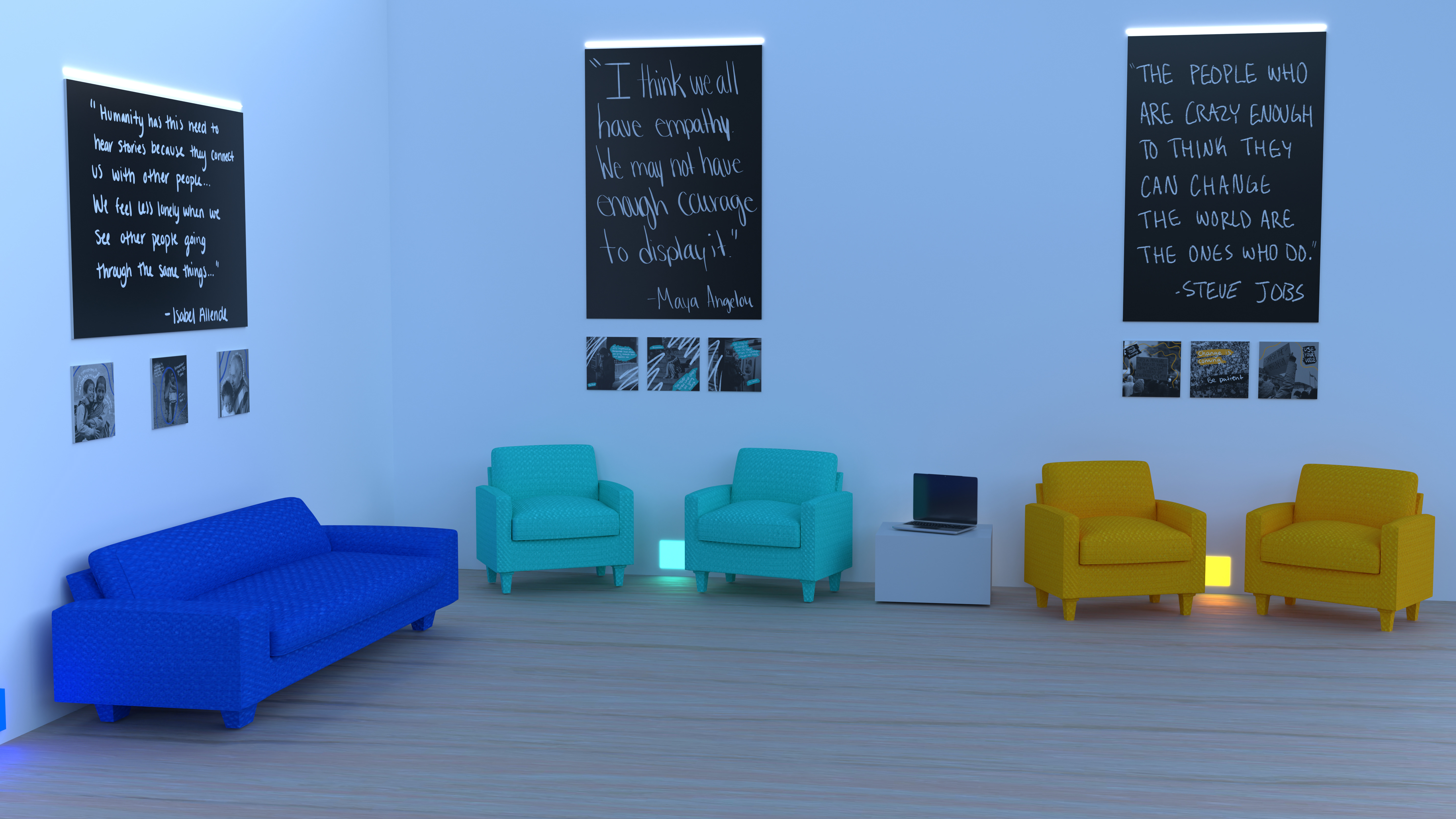
Illustrations